
I decided to break out the Yupo this week, just for a change of pace. My goal was to render some landscapes that, well, resemble landscapes, one here in Colorado, and the other next door in Utah…my second favorite state. Unlike watercolor paper, Yupo has a slippery, impermeable plasticized surface. It is more forgiving, but tends to require a different technique, as well as a bit more patience. I swear, some day I'm going to switch to oils or acrylics (or latex enamel) for God's sake, so I can paint over mistakes.
Below is an 8 X 10 inch watercolor on Yupo; it's based on a favorite photo I took of a rustic old mine shack in a wild-flowered setting—above Ptarmigan Lake and not far above Lovely Ouray.

Blue sky is particularly tricky on Yupo, so I chickened out and settled for subtle, hazy clouds. If a strong wet solution of paint is left unattended on Yupo it tends to puddle…and when is the last time you saw puddles in the sky? Too much brushwork leaves unrealistic brush marks and a sky that looks overworked. But who says puddles and brush marks and overworked skies are a bad thing... who says a painting has to look as real as a photo? What then is the use of painting, why not just snap a picture? Painting, or any artistic endeavor, is all about spilling your guts into a creation. Come to think of it, some of my paintings resemble that remark...
I tried practicing clouds and blue sky on a small piece of scrap Yupo, daubing with a kleenex, blotting with a paper towel. Kleenex worked pretty good but left small pieces of lint in its wake; they tend to get locked into the painting... forever. Paper towels have less lent but often leave a pattern. Try dampening the paper towel a little bit to diminish the pattern. The point doing these Yupo paintings was to "play" and have fun...not master the art form.
I kinda-sorta-almost approve of the way Mine Shack and Wildflowers turned out. I'm pretty hard to please when it comes to valuing my watercolors. They always fall short of what I conceived to paint. It is said that watercolors have a mind of their own, and that they are stubborn. I believe it. Time helps. I've learned to trash the junk and chalk it up to the gods of garbage, and to put the rest away in a box for a while. It's interesting how paintings I once thought awful get better sitting in a dark closet (now why did I hate this?). As always, an artist's biggest foes are fear and self loathing. Insecurity is our middle name, so it helps to keep expectations realistic (like, I'm going to just play and throw this away when I'm done), it loosens your grip and puts some of the fun factor into an afternoon spent on the other side of your brain…a scary place for some people. Just accept that Failure is a constant with watercolors, no matter how good you get. Success amounts to being bad less often. It's the truth; deal with it and move on with the next landfill bound painting. But seriously, keep a few of your early works to pull out a year from now, so you will realize that you are getting better. Ok, maybe two years :)) And remember, there are small lessons learned in every "failure." Eventually, you will make those same old mistakes less often :)
Since Watercolor has a mind of its own, it helps to go with the flow. Sometimes what we set out to paint begins to look like something entirely different. Go with it...see where it takes you. When you sense a painting going awry, stop…take a step back and study it from a distance. Let the shapes speak; have an open mind; and look for the smaller painting within the painting…some part that you like…grab the scissors and cut it out and pen it someplace where you can see it. It's ok to cut it up. No one will ever know about all the crap that once surrounded your little measure of success.

Decidedly overconfident after having had a smidgeon of "success" with the Mine Shack and Wildflowers 8 X 10 on Yupo, I decided to go big (it's a male thing). I always set out to keep my paintings loose, only to get bogged down in detail. When that happens put all your little brushes away and grab a big bertha brush…a roller if you have one…for they are not conducive to detail. I used a big fat # 20 on the above painting, a 14 X 18 inch Utah scene. Jesus, that's a lot of canvas to fill…which reminds me to remind you, keep your paintings small when you are a beginner. Do sketches that capture a main subject and mood, instead of every little detail. Make your early watercolors mostly sky... big skies, with clouds and a smidgeon of land or water along the bottom. Detail is the Devil in free, loose watercolor paintings. Paint 4 X 6' inch until you get the hang of it; only then should you move up one size at a time.
I don't consider the above painting "done"…I need to clean up some runs (or not) and mess with the vegetation some more (or not). I do need more shadows, tho…that always helps. As it stands right now, I kinda-sorta-almost like it…the way the sun reflects off that big butte is warm and soothing and it does remind me of Monument Valley. I like its depth, too, which was helped by including that distant range of monolithic hoodoos, far, far away.
Foreground, middle ground, and far ground is how you create the illusion of depth and scale on a two dimensional surface. Far ground should soften and lighten more and more as it layers into the distance. There is no detail to worry about in distant mountain ranges, therefore they are simple to paint. They can add needed depth.
Feel free to use any of the photos below to practice a watercolor of your own. Be sure to keep it simple.
Peace out; School's out. Now go do your homework and have fun.
mark


 |
| Bobbie used this photo for one of her paintings, believe it or not. It's one of her favorites…it "speaks." |


 |
| One of my failures that I grew to Water is difficult to paint…I still struggle with it. |
Good to hear from you and see the world through your eyes. As always great pictures..... and of course I always want to know where they are. I loved the pic of you guys in the slot canyon.
ReplyDeleteI like he Athabasca Falls painting. The water is good, and the trees with the mist hanging on the branches are good. The pictures of the Mission in Tucson are good - they're all good, but I liked your perspective on the place. How much longer until you're released from the House of Woe?
ReplyDeleteWhere is that fascinating place the guy with the beard is standing? I'm guessing the similar photos around that one are the same place.
ReplyDeleteI particularly like the rocks surrounding the falls in the last picture, lovely!
Metamorphosis Lisa
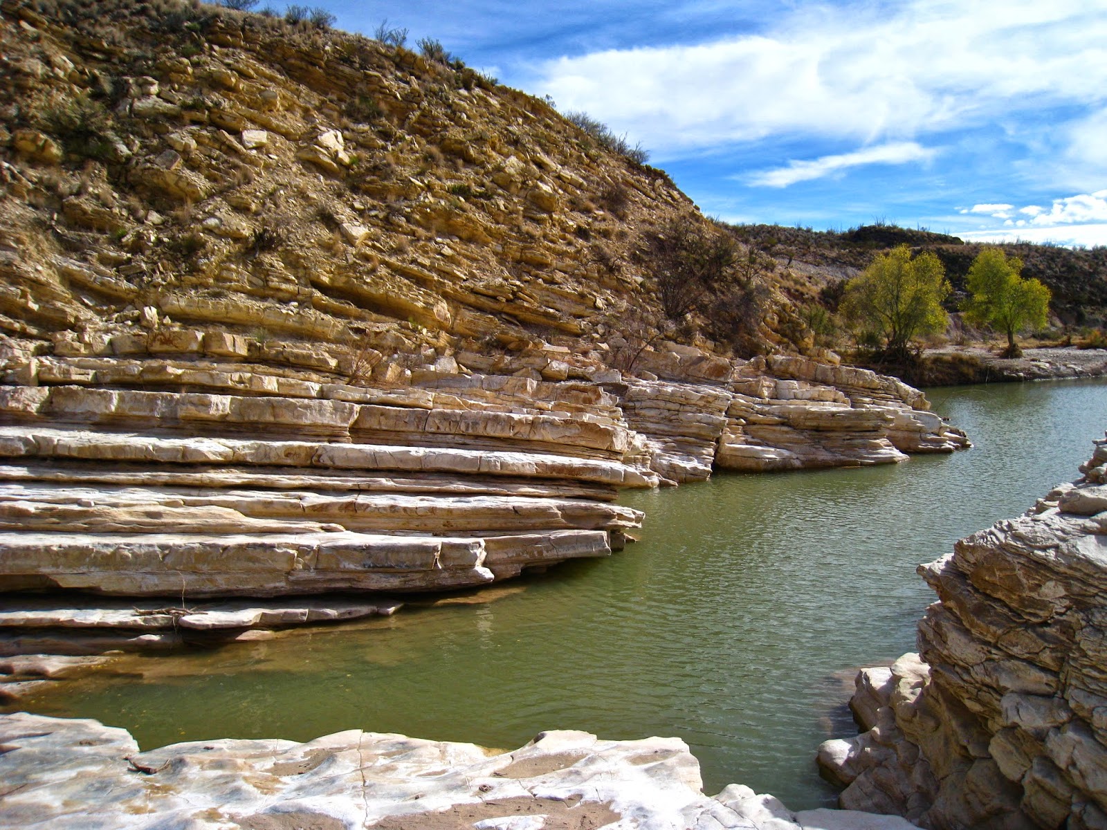
Thanks Lisa…that "fascinating" place is East of Big Bend and north of Terlingua (sp?), Texas, and so, too, the rustic building photos, just a stone's throw from the Rio Grand and Old Mexico. It was weird how flowing water carved so many smooth depressions in the rock…especially since water seldom flows there…
Deletemark
P. S.
DeleteAra (and Spirit) live near there... and they were nice enough to share their special discovery with the "Artful RV Adventurers…
mark
East of Bibe?
DeleteSome gorgeous watercolors there. I am in awe of your talent (I've tried myself and failed miserably).
ReplyDeleteLove the pic of the two of you in the slot canyon.
Nina
I really like your watercolor of the Utah scene. Hope you have your voice back!
ReplyDeleteGayle
As I was scrolling down through your pictures, I immediately thought of the Athabasca Falls as it started to show up on the screen. Must mean it's good!
ReplyDelete